
We’re chatting about covers on Chapter Break. ‘Cause you know we all judge books by covers, whether we admit it or not. We judge the style, the color and font choices, and just the overall look. That might not keep us from reading the book, but we do still judge.

- Amazon Kindle Edition

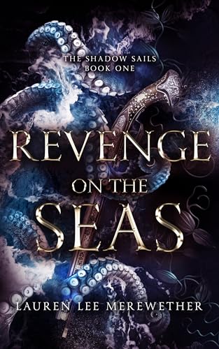
Why do I like a tentacles cover so? Is it because an octopus is smarter than most people I know?
I really like the colors on this cover. The blues and purples and darker shades go well together.
The Font is fabulous! I love the gold and the pointy shapes of it. Easy to read, well balanced. Good picks.
Now what is it that the octopus is grasping? Dagger? Pistol? I can’t tell for sure. It’s intricate and pretty carvings on it. I don’t see metal so I think pistol.
Overall I think this cover works for an angry sea novel with the title of Revenge on the Seas. I’d pick it up and read the blurb.

I agree with Julie. I’m all about the octopus on this cover. Those tentacles caught my attention right away. And I’d also pick up this book and read the blurb.
My main complaint is that the cover is very dark. The shadows make sense. But I think scaling back on the darkness a tad would make it easier to see what’s going on. But I suppose that’s the whole point of the darkness. 🤷♀️
The font is great. Easy to read. Good color. Balances out the octopus in the background.
I’m thoroughly intrigued by what’s going on in the background. Gold? Treasure? Plants? Not sure. But trying to zoom in and find out!
Overall, a great cover that got our attention in a positive way.
What are your thoughts on this cover?
Discover more from Chapter Break
Subscribe to get the latest posts sent to your email.

Leave a Reply