
We’re chatting about covers on Chapter Break. ‘Cause you know we all judge books by covers, whether we admit it or not. We judge the style, the color and font choices, and just the overall look. That might not keep us from reading the book, but we do still judge.
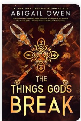


Ok but I might be obsessed with this cover style. I love the kaleidoscope effect. The bright gold against the dark brown is vibing well. The cover isn’t busy or overly complex, but it is enticing.
I like the title font with some letters being longer than others. The top font with the author’s name is easy to read and clear. Though, the smaller paragraph isn’t very easy to read. I guess you don’t need to know what that quote is unless you pick it up and look at the physical book?
I’ve heard of this series before but obviously haven’t read it and this is book 2. But it gets me curious.

Like Julie, I also dig this cover! And yes – totally checked out the blurbs of the first two books. Interesting!
I, too, like the kaleidoscope of the weapons on the cover. The other books in the series have the same vibes, but with different weapons. I appreciate the continuity across the series. The warm browns and golds draw the eye to the center of the cover, which is what we want in a cover.
The fonts are clear and easy to read. But I do wish the author’s name was in the same gold tones as the title, instead of white. That would have worked for the cohesion across the cover.
Overall, this cover is doing the job and grabbing our attention.
What are your thoughts on this cover?
Discover more from Chapter Break
Subscribe to get the latest posts sent to your email.

Leave a Reply